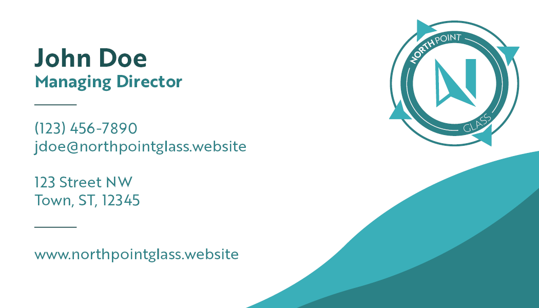
The business cards were designed to reflect the colors of glass and give the appearance of waves to pair with the compass logo design.


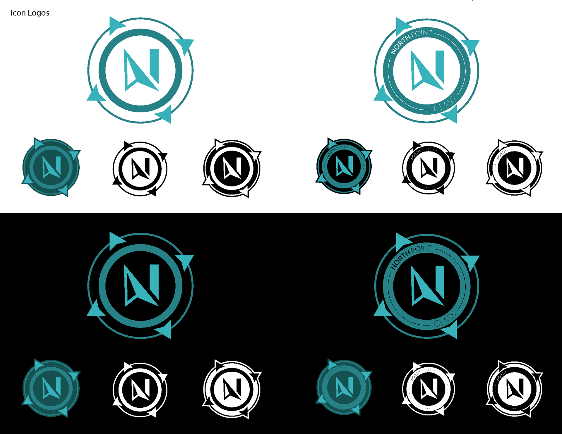
The logo is based on the shape of a compass to represent the north point, merging the arrow on a compass with the N in north.


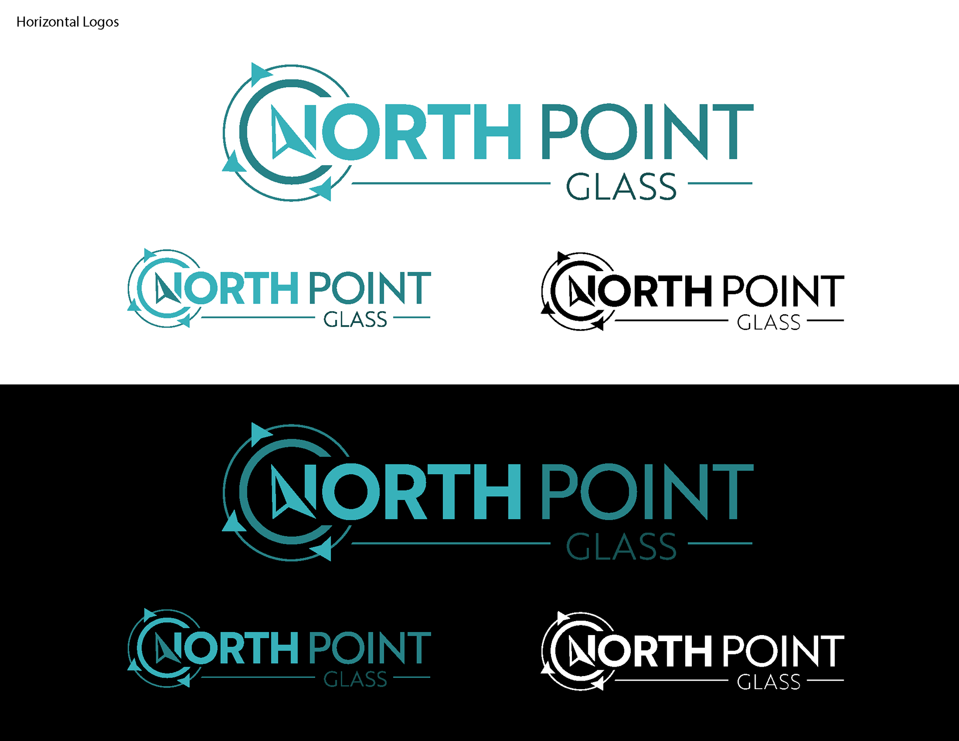
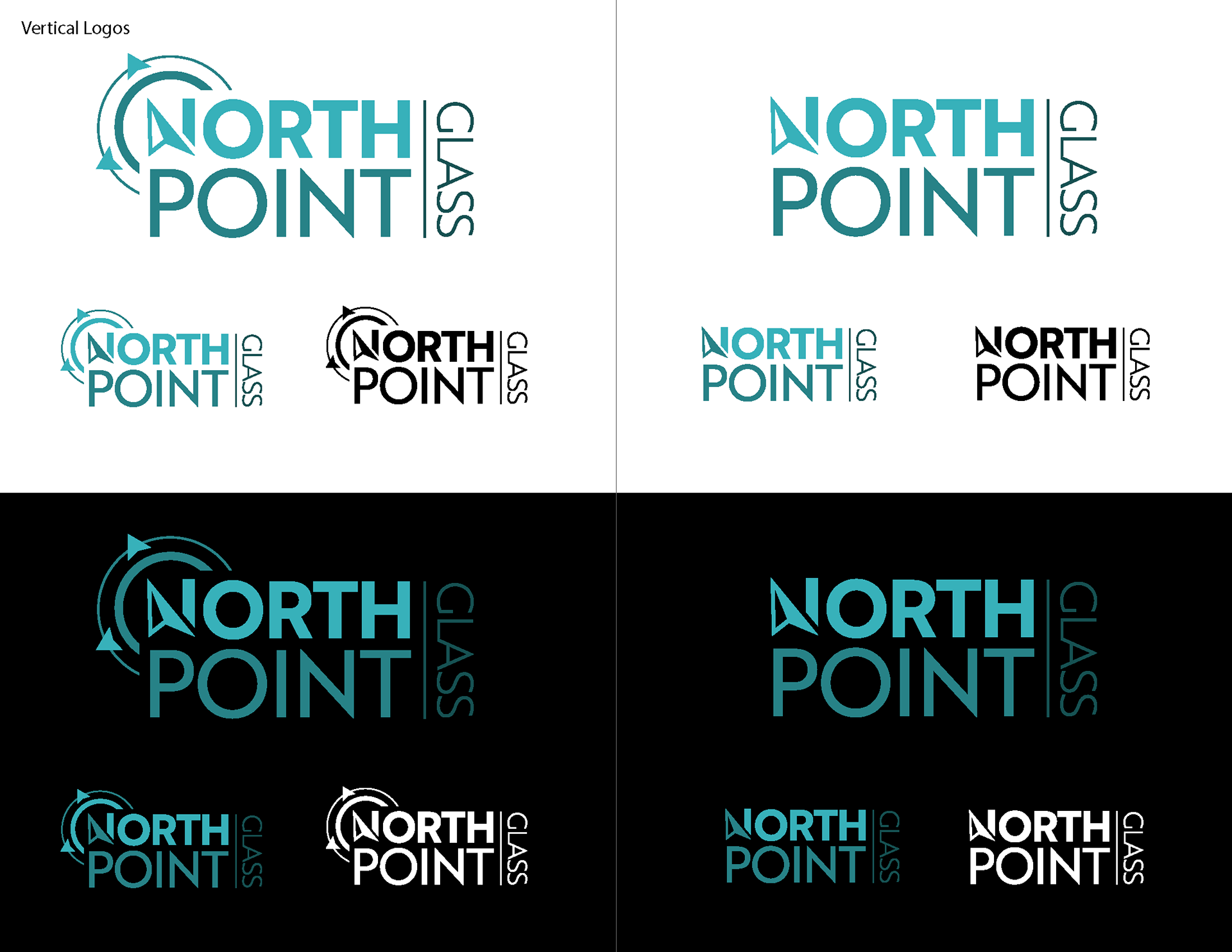
The branding guidelines dictate the different logo versions for horizontal, vertical, and icon. The horizontal version is the primary loge to be used. The logo colors feature a font gradient of weight, and a color gradient to give dimension to the idea of both sea glass and window glass.
The color scheme uses colors for sea glass as the primary colors, with natural colors as highlights and neutrals to reflect the area in which the company is located.
The font chosen is a San serif font that has weight options to represent both the depth and fragility of glass.
